Color Psychology: 4 Ways Store Colors Can Influence Shoppers
On this page
Colors have a significant impact on how we perceive things. In retail, every color used in a store tells a story that influences shoppers' perception of the merchandise. The right store color can enhance the brand's appeal and message. Moreover, color psychology can reduce objections to the purchase, regardless of the price. In other words, color can have a massive impact on customer experience, engagement, and store sales. In this blog, I will discuss four ways store colors can influence shoppers.
READ MORE: Retail Impact: Europe's Move Towards Sustainable Fashion
1. Tell A Good Brand Story
The colors you choose for your store can tell a powerful story about your brand that's hard to ignore. Research shows that the right colors can increase brand recognition by up to 80%.
In many ways, your store's colors become a silent language that subconsciously influences how customers perceive your brand. That's why it's important to use your colors consistently. Frequent changes in your color scheme can confuse customers about what your brand represents.
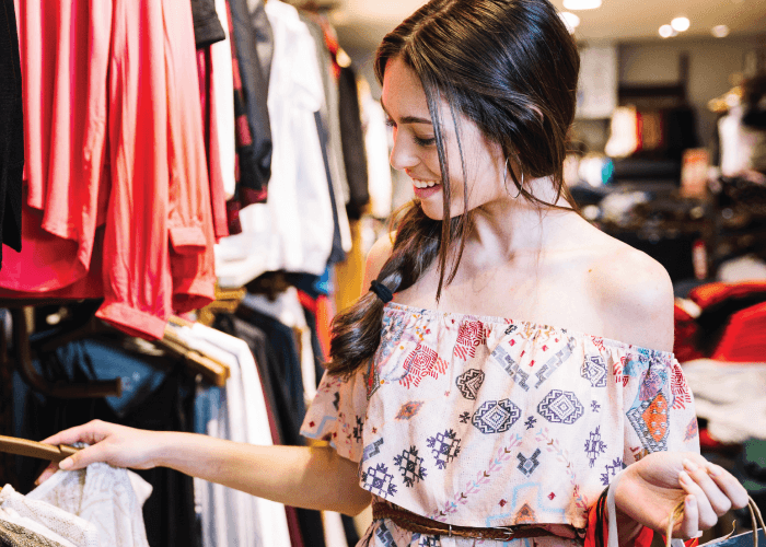
Suppose you want your store to be seen as a "funky" brand. In that case, you should use color schemes that include orange, yellow, and pink. These colors represent youthfulness, happiness, and excitement, respectively.
2. Make Customers Feel Secure
It's important to make shoppers feel safe in and around your store if you want them to buy anything. Unfortunately, many shoppers already have a negative impression of certain stores, which can make them feel unsafe and less likely to buy anything.
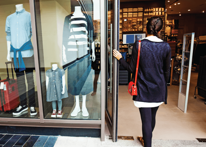
To help shoppers feel more secure and trust your store, consider using the color blue. This color is often associated with the sky and ocean, which can have a calming effect on people. That's why many banks and insurance companies use blue in their branding.
However, it's important to choose the right shade of blue, as some shades can also be associated with sadness and depression (like the "Monday blues"). By using the right shade of blue, you can help put shoppers at ease and create a sense of reliability and trustworthiness.
3. Add Flavor To Holiday Marketing
Shopping holidays such as Black Friday, Cyber Monday, and Boxing Day offer great opportunities to experiment with different color schemes to promote your store. It's important to use these colors not only in-store but also online. To maximize the impact of your holiday marketing, maintain consistency in your color scheme across all channels, both online and offline.
Another effective way to boost online engagement is through holiday email marketing. Use the same color scheme in your holiday emailers to ensure consistency. This channel alone could account for up to 20% of your holiday sales.
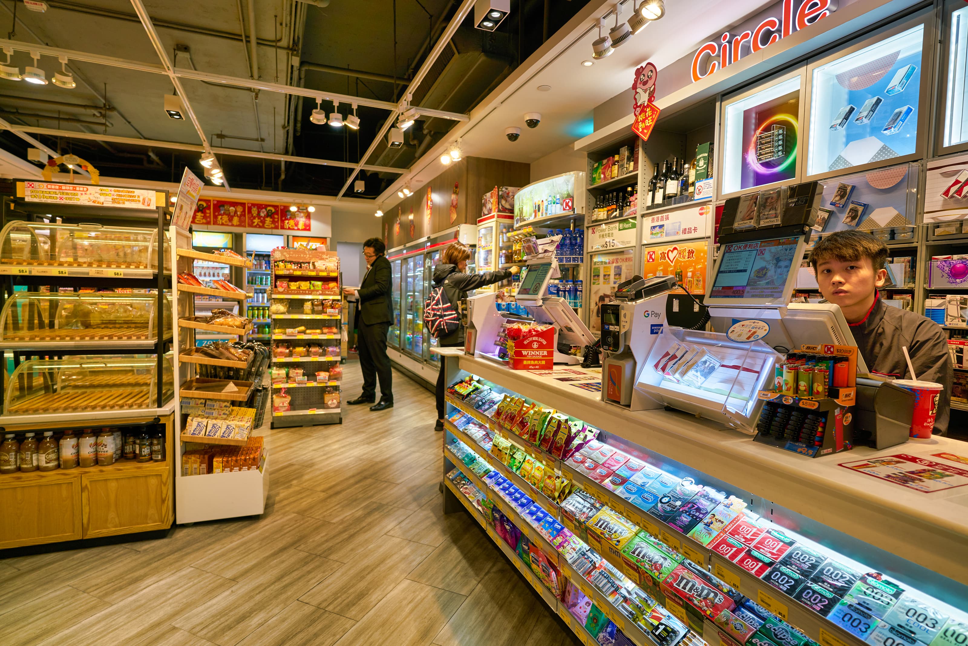
One of the popular color combinations used during Black Friday is a mix of vivid shades of yellow (gold), black, and red. Here are a couple of examples to help inspire your marketing efforts.
4. Project Luxury And Sophistication
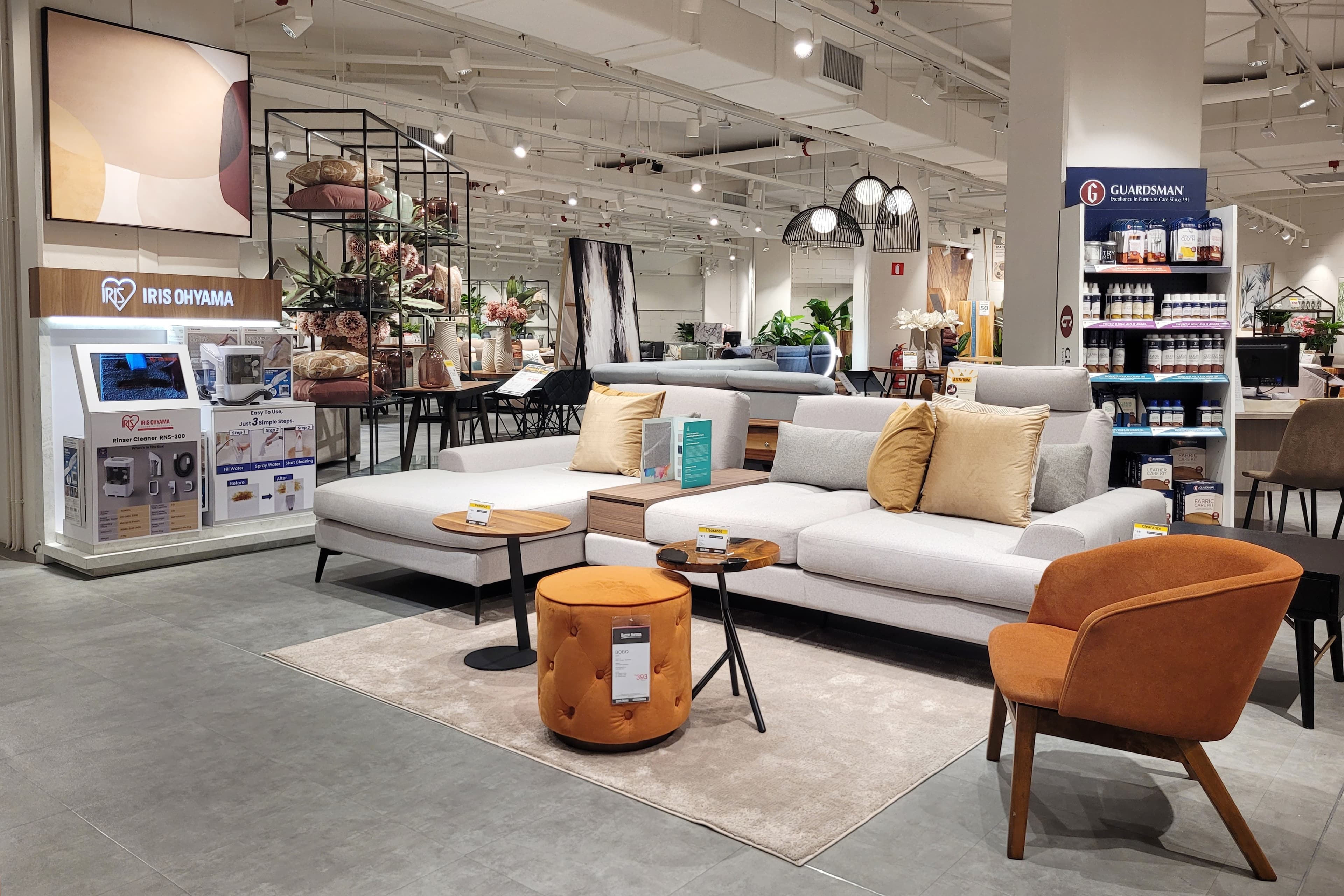
Many well-known brands such as Blackberry, Ralph Lauren, and Adidas incorporate the color black into their store decor. It has become synonymous with sophistication and can make both expensive and cheap products look equally elegant. However, it is important not to overuse black, as it can create a gloomy or even intimidating atmosphere that may deter shoppers. To achieve a classy look, it is recommended to mix black with a lighter color.

READ MORE: Understanding 'Hyperphysical' Luxury Retail
It is crucial to maintain consistency with your store colors, regardless of the color you select. If there is any inconsistency in any part of your store, shoppers are likely to avoid browsing through that section. This not only affects your sales but also creates an uncomfortable shopping experience, which can deter customers from returning to your store.
About the author:

Niraj Ranjan Rout, Hiver
